
On 21 April 2015, Google has made a huge announcement regarding the mobile search algorithm. After the changes have made, the mobile SERPs are totally changed as Google targeted for “mobile friendliness” as the main ranking factor in mobile search results. The date before the algo has changed, the site which was ranking well on the desktop version, was also ranking in top positions in mobile search results. But after the “mobile friendliness” has been applied by Google, the scenario is changed totally. The sites who have mobile optimized versions were having a boost in their rankings regarding their competitors who have not made mobile versions of their websites. Please note that this change is for mobile versions, not for the desktop versions.
For every SEO and internet marketing expert, why only them? Every business owner or a person, who has a website is well aware of the advantages of having a responsive website. But, as Google was not taking too much into account this SEO ranking factor, many of the website owners have not invested in making their site mobile friendly. But, all of a sudden Google has announced the change in mobile SERP and all the calculations were also changed from top to bottom. Many of the people, still don’t know how to deal with this mobile friendly algorithm of Google. So, here are the 5 essential tips about the “Mobile Friendly Navigation: Best SEO Practices of 2016” to guide you through the tactics to rank better in the mobile SERPs in 2016.
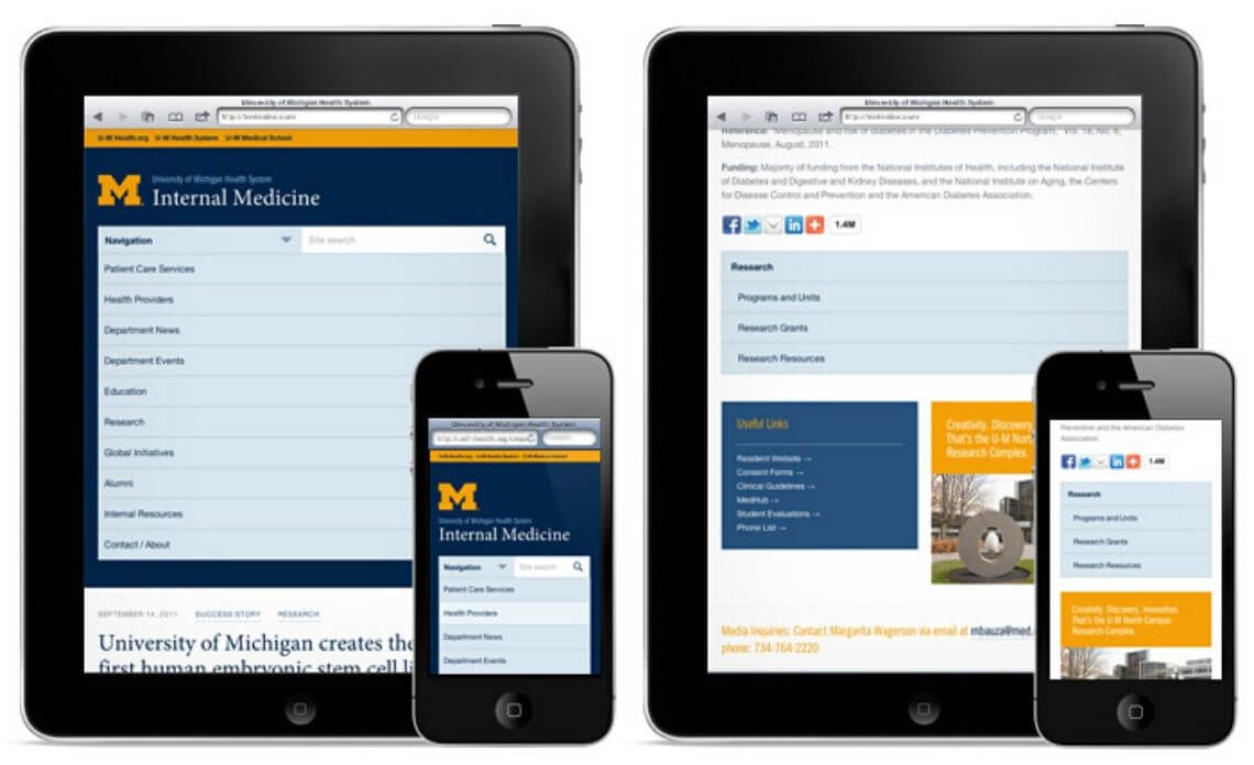
The main idea behind making the site mobile friendly is to make it designed for a small screen. And every developer should keep this in mind. Some android phones are having so small screen resolutions like 750 pixels in a portrait mode. So, developers need to use the limited room that is available to make the best user experience for mobile users. Make a list of which things do you want to show at the top priorities in your mobile versions, which things will give a better navigation to your mobile users, which sections of your site’s desktop version are not really appropriate for your site’s mobile version. This thing will help you keep your website mobile design short and sweet, and your customers will be happy to visit your site again and again.
2. Choose Meaningful Fonts and Colors
Mobile friendly design means to have simply readable fonts in appropriate colors. If your site has too small fonts to read, a user has to zoom in to read them. On the other hand, if you have too big fonts on your site, the user has to scroll down unnecessarily and makes it difficult to understand the whole description of your site. Also, if you have a good size of fonts, but if you use too much variation in font colors, then readers may get annoyed to navigate your site. So design your site with simple navigation text, that is easy to read and has adaptive colors to look attractive. If you are confused about the fonts you are using for your site, use this Google’s Mobile-Friendly Test Tool to check it.
3. Use Drop-Down Menu and Keep Your Important Pages Listed First
The drop-down menus with two levels of submenus will allow you to have a responsive menu that fits according to the screen size of the device and give an easy navigation between menu items. It will make the task of switching between menus easier and simpler. For a site having a large number of web pages, it is recommended that the main pages are kept at top places. It will make your users navigate through your important pages first and the chances of increasing the conversion rates will go higher.
4. Design for Touch, Not for Your Services
Mobile and tablet users rely on their fingertips to navigate through the features of the phone. Same thing applies when they are visiting your website on their device. From different surveys, it is shown that for an average mobile user the space required for navigating left to right and up and down is about 44 pixels. By keeping this thing in mind, if you build the buttons and clickable items under 40 pixels, then it will give a better user experience to your site’s mobile users. Keep the ease of users ahead of the services you are offering to them. If they like to navigate through your site, they will automatically check the relevant services that you offer to your visitors.
5. Build Responsive Design for Every Device
If you have a mobile friendly design of your website, then it will surely help you to increase your sales from smaller devices. Do not build the design of your site for some fixed sizes of different devices. Though space for building a responsive design is limited, you should build your website design for every type of device whether it is a cell phone, a smartphone, a tablet, an iPhone, or any kind of device. No one can tell which user can become your customer and which device he/she will use for that, so you have to rely on every single resource in which your site can be opened. Choose appropriate fonts, colors, and themes to look your site attractive and good enough to complete all the tasks the user need to complete to get your sales with easy navigations.
Remember that mobile friendliness means the best SEO results in search engine result pages of mobile versions. Make your site short and sweet whenever is possible, use easy navigation menus, make use of appropriate fonts and colors, build for making it task oriented and finger friendly, prioritized with important pages and features. Hope you like the post for “Mobile Friendly Navigation: Best SEO Practices of 2016”. Build your mobile friendly site using this 5 best SEO practices and rank better in mobile search results in 2016.

